Copyright © 2008 THE IKE GROUP. All Rights
Reserved.
Check out the new Ike
Club on THE IKE GROUP Forum.
Rob Ezerman for the Ike Group
SUNDMAN-LITTLETON LECTURE
Thursday 31 July, 2008
ANA Convention, Baltimore MD
Copyright © 2008 Rob Ezerman. All Rights Reserved.
Propaganda and the Design of the Eisenhower
Dollar
SUMMARY
This is a story of
propaganda versus patriotism told in the design sequence of the Eisenhower
Dollar reverse. Cold war jitters and
political realities forced Frank Gasparro to change his initial design of the coin's emblematic Eagle from fierce to friendly but Gasparro
was not to be denied. When his
original “Friendly Eagle” low relief reverse design had to be abandoned,
Gasparro had the opportunity to revise that design back toward his original
fierce Eagle.
INTRODUCTION
Frank Gasparro,
the Grandson of Italian Immigrants, was born in 1909. When Frank dropped out of High School at age 16 to attend art
classes and help support his family, he already manifested hallmarks of his
core character: stubbornness and
loyalty (even in frail health in his 90’s he insisted in teaching art classes
up to three weeks of his death).
Known to be
fiercely patriotic, Gasparro admired, “hero worshipped” really, Dwight David
Eisenhower as did so many.
Ike died on March
28 1969. He did not live to see the
success of Apollo 11 a few months later, the first Apollo mission landing men
on the moon, memorialized by Armstrong’s words at touchdown “The Eagle has
landed!”, and later as he stepped onto the lunar surface, “One small step for a
man, one giant leap for mankind”. But
it was Ike who had helped instigate, and then signed into law the act creating
NASA which launched our great space race with the USSR.
Throughout 1970,
Congress and the Mint were fighting over composition and mintage parameters of
the proposed commerative Eisenhower Dollar but Gasparro was already well into
its design, a portrait of Eisenhower on the obverse and Gasparro’s rendition of
the Apollo 11 Mission patch on the reverse.
Before we get into
the heart of this talk, here are a few background specifics about the Ike
Series to help set the stage.
In 1971, there
were two different Ike designs minted and released for the public: high relief and low relief. The high relief design was used only for the
silver clad proof. The low relief
design was used for both the copper-nickel clad business strikes and specimen
silver clad Ikes.
The 1971-S high
relief silver Proofs were distributed in Brown boxes and the low relief silver
specimen Ikes in Blue Envelopes. The
1971 low relief clad circulation Ikes were minted furiously beginning July 3rd
at the Denver Mint (and later in July at the Philly Mint) and were stockpiled
at the Federal Reserve Banks serving the Denver and Philly Mints, respectively,
for release to their downline banks in time for public distribution on November
1st 1971.
While the 1971
high relief Proof received considerable pre-release publicity beginning in the
second half of 1970, including photos and four sets of Galvanos, full
production and early distribution of the proof didn’t crank up until December
and the majority of 1971 Ike Proofs weren’t produced until March, 1972.
I mention this
because the Mint forcefully publicized the high relief design while not revealing
any photos or Galvanos or otherwise publicizing the low relief design destined
for the circulation and business strike specimen silver clad Ikes.
The only publicity
about the low relief circulation clad Ike was its expected date of release
(which kept getting pushed back throughout the first half of 1971). Since the low relief obverse design is
basically the same as the high relief obverse design, it’s logical that the
Mint seemed not to know what the low relief reverse design would be right up
until the last few weeks before circulation Ike minting commenced. And that may be exactly what happened.
This talk will
cover the Ike Group’s findings and speculations on the two known low relief
reverse designs for the first year (1971) and how the second low relief design
gave Gasparro a victory over propaganda.
(We’ll ignore the
obverse since the only design tension we have found is Lee Lydston’s Prototype
Ike which will be introduced and discussed at our “New Ikes” Workshop
tomorrow. Shameless plug, sorry.)
CHAPTER 1 -
THE “FRIENDLY” EAGLE AS PROPAGANDA
Let’s begin our
story of the two low relief reverse designs of the 1971 Ike dollar with the
story of the Apollo 11 Mission Patch, the predecessor of the Ike reverse.
Michael Collins
tells of the patch’s design evolution in his book “Chariots of Fire”. First sketched a few months before the
scheduled July 1969 lift off, the design concept was simple: an Eagle, the symbol of our great nation,
approaches the moon for a landing, olive branch in beak, a distant Earth
hanging overhead.
Writing that a
wheels-up landing was a recurring nightmare he shared with many pilots, Collins
drew an Eagle with talons out-stretched:
“My eagle was going to have its landing gear down!” Collins wrote.
ORIGINAL APOLLO
11 MISSION PATCH DESIGN
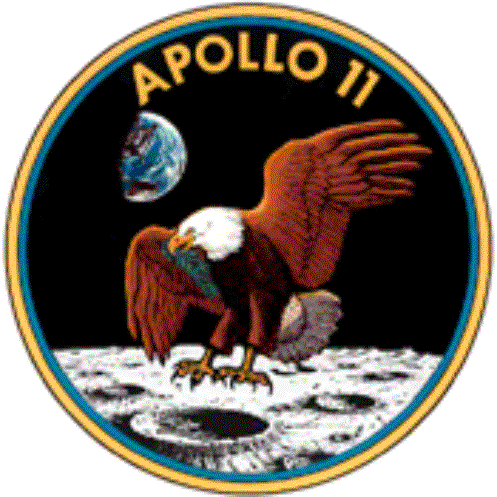
Collins’ design
was submitted to “authorities” who promptly rejected the image, saying that the
Eagle looked too fierce, too war-like with those out-stretched claws.
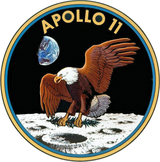
Stunned, Collins
and the other astronauts had a brain storm:
they would move the olive branch from beak to talons: the talons would now be clenched instead of
spread. This revision was promptly
approved.
APOLLO 11
MISSION PATCH, FINAL DESIGN
Let’s return to
the Eisenhower dollar coin. On October
29, 1969 Texas Congressman Bob Casey made a motion on the floor of the House
that the reverse of the new Eisenhower Dollar commemorate Apollo 11. His initial motion stipulated that the words
of the Apollo 11 Motif, “WE CAME IN PEACE FOR ALL MANKIND”, be spelled out on
the reverse. Since there would not be
room for all these words in addition to UNITED STATES OF AMERICA, ONE DOLLAR,
and E PLURIBUS UNUM (the Ike is a big coin but not that big), he revised his
motion to stipulate that the reverse be “Emblematic of the Apollo 11
Motif”. The enabling legislation was
finally passed and signed into law over a year later at midnight December 31,
1970.
Meanwhile,
Gasparro was not waiting for congressional authorization and immediately
started work on obverse and reverse sketch designs for the new dollar coin (at
that time the Mint was hoping to receive congressional approval in time for
minting and distributing a 1970 Ike dollar).
GASPARRO’S
ORIGINAL IKE REVERSE SKETCH DESIGN
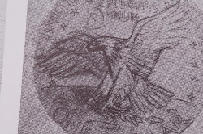
At the heart of
this Sundman lecture, Gasparro’s late 1969 initial reverse sketch drawing was
rejected by Mint Director Mary Brooks:
she stated that Gasparro’s Eagle was “too fierce, too war-like, a little
too threatening”. ‘Déjà vu all over
again’. But this time I think the
rejection was big deal: Gasparro had
drawn the Eagle that fulfilled his artistic and patriotic vision, a bold,
proud, fierce and vigilant defender and symbol of the Nation he loved so much,
only to be told he had to make it less of an Eagle.
Please note
Gasparro’s sketch captures an Eagle in flight, feathers flared.
We have no record
of the Gasparro sketches that were finally approved by the Treasury’s Design
Authorities, but judging from the 1970 Reverse Galvano and the very similar
1971-S high relief Ike Proof reverse, his revised and approved Eagle was indeed
a changed bird: it had no “deeply
furrowed brow line” and the body and tail feathers were not flared, resulting
in what Gasparro himself termed a “friendly, peaceful, pleasant Eagle”.
1970 IKE REVERSE GALVANO
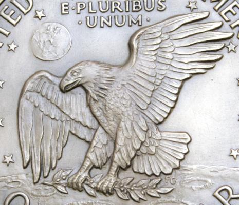
Note that a galvano is in
much higher relief and has more detail than the downline hubs, dies and strick
coins. Here is the 1971-S production
proof which is virtually identical in design to this Galvano:
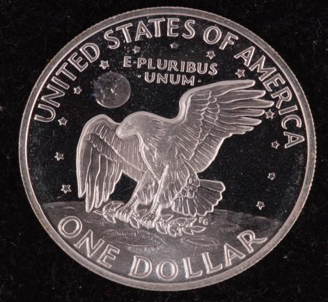
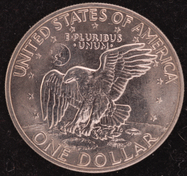
1971-S
EISENHOWER DOLLAR PROOF
Ike Group member
David Golan describes this Friendly Eagle as “a bird at rest, the left wing
(our left) wing relaxed, the opposite of a fierce Eagle coming in for a
landing”. Note the absence of sharp
feather separation and no flare of body feathers.
One wonders what
Gasparro really thought of this “pleasant” Eagle? Here is one answer directly from Gasparro, his obverse design for
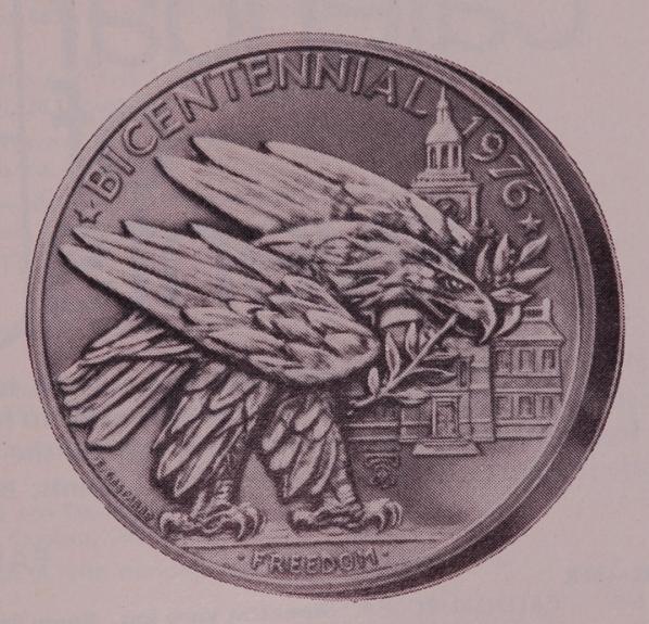
a 1976 Bicentennial medal. ‘Nuff said!
GASPARRO BICENTENNIAL MEDAL OBVERSE
Why were both
Collins’ and Gasparro’s initial Eagles designs rejected? There was ample precedence for a fierce
Eagle. After all, the Eagle is a
predator and not somebody’s friendly pet.
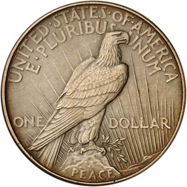
For example, here is a slide of the reverse of the Ikes predecessor, the
Peace Dollar with which Gasparro grew up as a young man.
1921 Peace
Dollar Reverse (high relief)
The answer is
conveyed in Bob Casey’s public insistence that the Eisenhower Dollar reverse
symbolize for all the world the motif of Apollo 11, “We came in Peace for All
Mankind”.
Why the concern
about the appearance of the Eagle? Why
the need to turn the reverse of the Ike dollar into an instrument of Government
propaganda?
Because the United
States was in a cold war nuclear stand-off with the USSR. Remember Mutual Assured Destruction, MAD for
short and all too possibly for real?
Let’s take a
moment to summarize the political climate leading up to the late 1960’s.
In the preceding
16 years the world had been shaken by the Soviets crushing the East German
uprising of 1953, the violent suppression of the Hungarian rebellion of 1956,
Castro taking power in 1959, the erection of the Berlin Wall in 1961, the Cuban
missile crisis in 1962, Vietnam for most of the ‘60’s and the tanks-in-the-street
suppression of the Czech “Prague
Spring” in 1968.
As the decade of the 1960’s matured there were elements of
“rapprochement” but it was far from an easy time.
I was in my 20’s
and vividly remember periods of considerable anxiety that some trigger-fingered
general on either side would start WWIII, a fear captured well in 1964’s dark
comedy, “Dr. Strangelove, or How I Learned to Love the Bomb”.
|
|
|
|

Against this
background, 1969’s Apollo 11 was the culmination of a massive US Governmental
program to land military men on the Moon.
Remember that the moon always shows us the same face: an observer on that face would always be
looking straight “down” at the Earth.
The moon would be an ideal observation site and launch pad, among other
potential military considerations. At
the extreme, getting to the moon first with military boots on the ground could
possibly tip the balance of power to our side, perhaps increasing the odds of a
Soviet first strike.
It’s
understandable, therefore, that NASA and our Government sent out a continuous
world-wide stream of propaganda that Apollo 11 was a peaceful mission and only
a peaceful mission. Everything public
about Apollo 11 had something to do with peace. We even landed in the “Sea of Tranquility”. Every official plaque and mission statement
emphasized that this was a peaceful mission on behalf of all mankind.
(By the way, it’s
the second definition of propaganda that implies dishonesty or
mis-representation. The first
definition is simply persistent, organized and coherent communication of ones
position. And of course our propaganda
would always be on the up and up with no programs deep in the pentagon looking
at the military advantages of a successful moon landing. Certainly not.)
Our government
continued its propaganda push throughout the Apollo program. But shortly after Apollo 11 here comes the
design proposal of what could be the most important souvenir and representation
of Apollo 11 on the flip side of the new dollar coin destined to circulate
world wide, a most popular President on the other side. No wonder the lines of authority in
Washington DC would not permit a “war-like” attacking bird of prey to represent
Apollo 11 on this new dollar coin!
So Michael Collins
initial Mission Patch design and Frank Gasparro’s early reverse sketch were
rejected for much the same reasons.
Collins had to retract his landing gear and Gasparro had to soften the
ferocity of his beloved American Bald Eagle, make it “peaceful and
friendly”. Utter nonsense when one
thinks about it and believe me, Gasparro had thought about it having spent
considerable time studying the habits of the Bald Eagle at the Philadelphia Zoo
and reviewing previous numismatic and other artistic renditions.
Frank knew that
his beloved American Bald Eagle is not a friendly creature but a deadly swoop-and-destroy killing
machine. But he had no choice. The official need for propaganda consistent
with government policy over-ruled Frank’s artistic and patriotic
instincts. The Eagle had to be
“friendly”.
CHAPTER 2 -
TWO RELIEFS and TWO LOW RELIEF REVERSE DESIGNS
By mid-1970,
Gasparro already had two sets of Master Hubs, one pair in high relief,
presumably the design we see on the 1970 Galvano and the high relief 1971-S
Proof, and one pair in low relief. Why
two sets? It had become painfully
obvious earlier in 1970 that the available die steels were not tough enough to
strike his high-relief design onto the hard Copper-Nickel clad planchets being
used for circulation Ikes.
According to
Gasparro, to arrive at the low relief dies he working intensively from the
Galvano through successively lower relief test dies until he finally hit upon
the highest low-relief dies that
didn’t crack up in use, a time consuming process. While this is probably factual as far as it goes, Gasparro never
talked about the specifics of the low relief design let alone that there were
two of them. The Ike Group has no such
reluctance. . .
CHAPTER 3 - THE TWO
LOW RELIEF REVERSE DESIGNS
As mentioned
earlier, unlike the Mint’s highly publicized distribution of photos and
Galvanos of the high relief design, the Ike Group could find no such publicity
or even a public record of the low relief design.
If the Ike Group
is correct, however, Gasparro’s initial low relief reverse design was that
which we now call the “Friendly Eagle Variety” (FEV for short) (Wiles Catalog
number RDV-006). The second low relief reverse design is
that present on all the other 1971 circulating and silver specimen low relief
business strike Ikes.
Let’s look once
again at the high relief friendly Eagle design: no brow line and no emphasized feather separation, a peaceful
bird at rest. First, the 1971-S Proof
reverse with a close-up of that Eagle’s head and then the Friendly Eagle
Variety reverse:
The low relief
1971-D Friendly Eagle Variety’s Eagle also has no brow line and only minor
artwork adding some separation to the tail feathers. In other words, the low relief FEV reverse design also carries
the mandated “friendly, peaceful” Eagle and closely resembles the high relief
proof design and not Gasparro’s initial sketch design:.
1971-D FRIENDLY EAGLE VARIETY REVERSE
It’s important
that certain design features of the FEV are consistent with a planned low
relief CuNi-clad proof bearing this FEV design. In this regard, it’s interesting that
several million Ike clad proof planchets were used by the Denver Mint in their
1971-D circulation Ike production line.
Where did these clad proof planchets come from?
1971-D PROOF PLANCHET
(Note that it
would not be possible to “polish” either such a worn die or the several million
proof-like ’71-D Ikes which also are free of planchet chatter.)
For some reason
the clad proof project was aborted (we suspect die failure) but not until
several million CuNi-clad proof planchets had been acquired and mostly
prepared. These now surplus proof clad
planchets were shipped to Denver for use in Denver’s 1971 regular production
line. (Clad proofs were not minted
until 1973 when tougher, more resilient die steel was available and all Ikes
were minted in high relief.)
We speculate that
the Friendly Eagle Variety (FEV) design was also the planned reverse design for
all low relief circulation and silver specimen 1971 Ikes but was found to be
unsatisfactory for this purpose, too, probably through full-die-life test runs
of multiple FEV dies on clad planchets at the Philly Mint. This is speculative but not wildly speculative as our thinking is
based on the remarkably low percentage of several different FEV DD’s and
DDO-DDR pairings and partly on the remarkable prevalence of “Very Late Die
States” among FEV’s.
At any rate, like
the abandoned low relief clad proof project, any plan to use the FEV reverse on
low relief circulation Ike production was also abandoned.
Working through
all this would have soaked up a lot of time.
In fact, it is our
suggestion that the failure of the FEV reverse design forced Gasparro to come
up with a new low relief design with time running out. Severe
time pressure would explain the crude and hasty-appearing added artwork on the
low relief design finally used on all 1971 circulation and silver specimen
Ikes, the subject of the next and last chapter.
CHAPTER 4 -
GASPARRO’S REVENGE
By whatever means
Gasparro arrived at his final low relief reverse design, we can reason it
looked somewhat flat and blah because the 1971 low relief circulation and
silver specimen Ikes all have the same hasty-appearing somewhat crude added
artwork to give this low relief design greater visual presence. But Gasparro now had the opportunity to
revise the propaganda-mandated friendly Eagle design: he could create a design that would recover some of the
fierceness of his original reverse sketch design.
So what were
Gasparro’s low relief design modifications?
He gave the Eagle’s tail and wing feathers greater separation, ruffled
the body feathers; and, he replaced the deeply furrowed brow line! Let’s look through some slides and let them
tell this part of the story.
(To put this in
perspective, we know of no other series that has a reverse with so much crude
added artwork upon its initial release.)
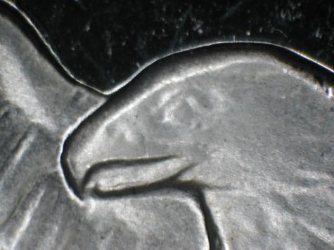
1971-D FEV EAGLE’S HEAD
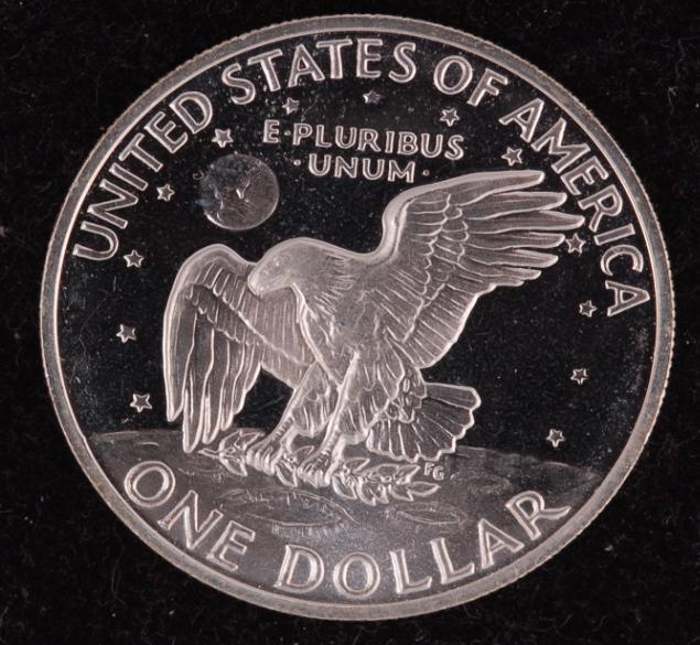
1971-D COMMON PRODUCTION IKE
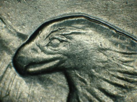
Note the
strong resemblence between the low relief FEV’s Eagle Head and the Eagle’s Head
on the high relief 1971-S (Friendly Eagle) Proof.
Also, note
that the brow line added to the 1971-D low relief common production Eagle Head
is crude and looks like the last-minute added artwork it is. Here is a photo of a “Very Early Die State”
example of the added brow line with lighting adjusted to highlight the crude
artwork:

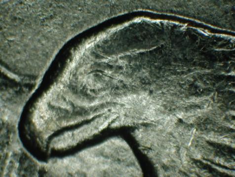
1971-D FEV
CHEST AND LEFT WING FEATHERS
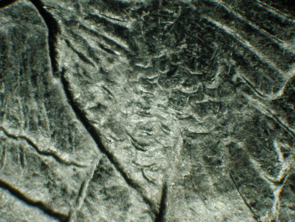
The
body feathers lay flat and the left wing (our left) feathers are not separated
and also appear to lay flat, consistent with a bird at rest or at least one not
swooping down in a predatory attack, in other words, a “Friendly” Eagle.
1971-D
PRODUCTION IKE FEATHERS
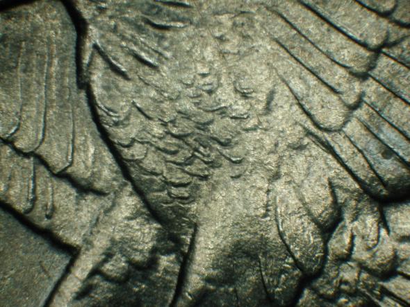
Here, both the separated left wing feathers and
the flared body feathers are consistent with a bird in flight
and more consistent with Gasparro’s original sketch design.
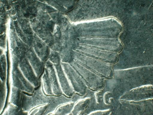
Let’s
look at the Eagle’s tail feathers:
you’ll notice that they are all separated with heavy crude artwork on
the 1971 production circulation Ike. On
the FEV, however, the two top feathers have no added artwork separation and the
rest of the tail feathers are not has forceably separated:
UPPER PHOTO: FEV TAIL FEATHERS
LOWER PHOTO: COMMON PRODUCTION
IKE

Bottom line? The revised
low relief reverse design used for all 1971and 1972 low relief Ikes (except the
FEV) now resembles Gasparro’s original rejected reverse design sketch! How satisfying this return to his original
design must have been for this loyal and patriotic but proud and stubborn
man! What a delicious bit of
soul-satisfying mischief.
I’m told the ANA
will eventually have a video of this lecture on its website, www.money.org . I used some of this writing but had to jump around and leave out
quite a bit due to time constraints.
The video should capture the overhead transparencies I used during the
lecture.
The Ike Group,
seven Ike nuts devoting spare time to Ike research, welcomes any feedback,
observations and questions.
Our web site, www.IkeGroup.org is under construction but at last it’s up so
please check it out! There is already a
wealth of information with a whole lot more to come.
Questions,
supportive comments or gripes, please feel free to contact lead author Rob
Ezerman at doctortrucker@aol.com .
We are
enthusiastic Ike supporters and are doing our best to light a fire under the series: we realize any of our conclusions may, and
certainly some of our speculations will, change over time as we add more pieces
to the Ike puzzle: there will be more
than one edition of our “Ike Book”.
Rob